(Mobile UX) Doculife - iOS & Android App Onboarding
What was Doculife?
In my role focused on the mobile onboarding experience, Doculife was a B2C storage service which allowed users to organize photos, PDFs, and other files in what the service called Binders. The thumbnails for these binders would display the files in a more visual way. Additionally, what set Doculife apart from competing storage services was that we included interactive widgets like calendars, maps, progress trackers, linked videos, etc. This was because we had additional target audiences including food bloggers (we even hired a vegan food influencer with her own promotional binder), wedding venues, and travel planners.
Problem
When I was hired as one of 10 employees, the company was at an early growth phase. At this stage, the mobile app available for download was incomplete with frequent crashes and basic wireframe styling. We needed to bring our mobile app to a completed state before our second phase of funding. The lack of a complete mobile app meant new accounts were not being created and the service wasn't generating revenue. This case study coincides with the case study for Design Director Jay Richard's documented process for Doculife Global Inc. You can view his case study here.
Overview
For this case study, I'm only focusing on onboarding as it demonstrates my early security-first mindset and enterprise thinking. My role was focused on fulfilling the business need for a more polished UI and design aesthetics. The visual prototypes and mockups, including animation, aligned with the already established UX strategy and guidelines set by the design director. I received permission from Doculife CEO David Tucker to include my internal design process before my departure. Internal design process includes all screenshots and beta versions of the app I only had access to. With little to no trace of the app's existence, my saved documentation and recordings came to the rescue. As a non-NDA case study, I'm able to share internal design deliverables where relevant.
Collaboration
I scheduled regular syncs with the design director, developers, and CEO across a globally distributed startup so design and development were aligned.
Results
With the overhaul of Doculife’s mobile app, the startup was able to increase its new users five-fold in two months. While the company or app no longer exists due to external factors beyond the responsibilities of the product team, the new direction was still proven effective for the business.
Lessons Learned
The most important takeaway from my time with Doculife was improved organizational hygiene of design files, along with a solid understanding of writing good product documentation with exact measurements for UI elements for developers. Alignment and communication were a struggle early on, so this habit became a foundation that improved further when I began writing design briefs at Turnitin. I was also able to more closely bridge the gap between design and development with my already solid understanding of HTML/CSS/JavaScript as our mobile app was written with React Native. React.js became a skill I began developing toward the end of my time at Turnitin.
While Doculife was a B2C product, this early work in my career paved the way for my pivot into Enterprise B2B because the UX involved complicated handling of data, image uploads, and topology. This work was what Turnitin needed to see in my portfolio at the time, as their immediate business need was to hire an associate designer who already worked with data heavy applications, as ExamSoft is a data-heavy product family.
My Role
I was a contract UI/UX Designer, working under the supervision of Digital Director Jay Richard, who used the following methods to successfully receive full buy-in for the new mobile app experience within an agile environment:
- Analysis of UI gaps
- Written Scope Document
- Animated Prototype
- Final Mockups with Annotations
Stakeholders
- Design Director
- Founder
- Developers
Tools
- Figma
- Principle for macOS
- Adobe After Effects
- Microsoft 365
Timeline - Phases
Foundational Deliverables: May 2020 – July 2020
- Development & Release: July 2020 -December 2020
1
Where We Were
These saved screenshots I took shows what the onboarding for the mobile app looked like on March 7, 2020 before I joined the company. This was a publicly available app lacking the onboarding maturity users would expect. There weren't enough steps to establish clarity early. The two blockers were:
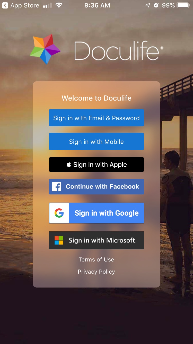
Unfocused welcome screen - the welcome screen was a collection of various social login buttons with no clear starting point, this led to users remaining confused as to how to begin.
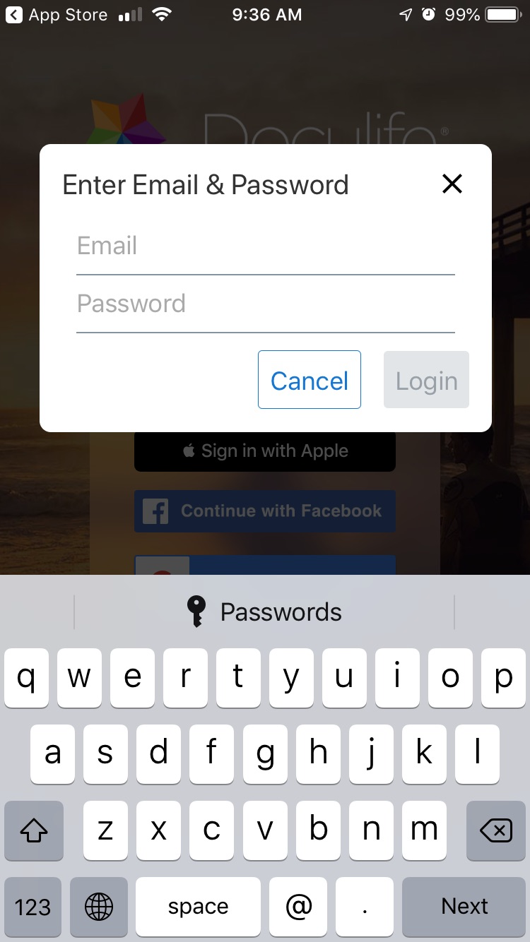
Textfields within modal - it isn't standard for email and password fields to be within a modal.
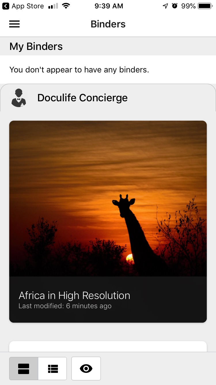
Wireframe homepage with no guided tutorial - the user would just arrive at a grayscale homepage with no guided starting point.
2
Key Decisions
Based on analyzing onboarding experiences from other mobile apps, I identified essential additions to address confusion and bring the onboarding experience to customer expectations:
- Separating email and mobile buttons from social buttons – this made the welcome screen less cluttered and more focused on being more accessible to both new and returning users
- Link to create new account – this was lacking in the app in the beginning, and it needed to be added
- Link to get back to welcome screen – adding the link back to the welcome screen gave users a safe way out if they were stuck, as this was a key pain point
- Sign in on the screen instead of within a modal – this was a standard pattern adopted where textfields within a mobile app are not within a modal
- New user onboarding – this was a necessary addition so new users could be guided on the new platform they signed up for
- Unexpected error messaging – these messages were designed to inform the user on what has happened rather than the app crashing or freezing
3
New Onboarding Videos
These saved videos of early development previews, only available to me, showcase the new onboarding experience in action. Screen recordings are of actual app footage developed following my hi-fi compositions in Figma.
4
Impact
The redesigned onboarding experience delivered measurable improvements across three areas:
- Clear guidance – the redesigned workflow gave the user easier pathways to login/signup without the clutter of the original state of the app
- Complete workflow – a finished onboarding sequence set clear expectations for new users from the beginning
- Reduced errors – a more developed experience meant less crashes and bugs
Selected Works


Copyright © Nathan Nasby